Energy in Action Mobile Interactive Exhibit
Situation: Energy in Action is a mobile learning experience sponsored by EnergizeCT, an energy-saving initiative by a collection of electric and gas utility companies in Connecticut. Through engaging, hands-on activities, students at local schools learn about renewable energy, energy efficiency, and sustainability.
After several successful years on the road, the trailer was in need of maintenance. Considering this, EnergizeCT decided it was time to refresh the design of the trailer to stay fresh and relevant to students.
Task: As the Art Director at The National Theatre for Children, I was tasked with leading an Energy in Action brand redesign, designing new wrap graphics for every surface in the trailer to align with the new brand, and collaborating with teammates on the design of new, exciting activities.
Design Approach:
For the rebrand, I wanted to focus on optimism and future-minded thinking, since Energy in Action focuses on building a greener future. I proposed a retro-futurism direction for the overall design language, as it would appeal to a wide range of ages and resonates culturally right now (as seen in recent films like Inside Out and The Fantastic Four). Initially we were under the impression that we would have much more freedom in terms of branding, but after learning we'd need to stick closely to an existing brand guide, I pivoted and found a way to integrate these ideas within the EnergizeCT colors and fonts.
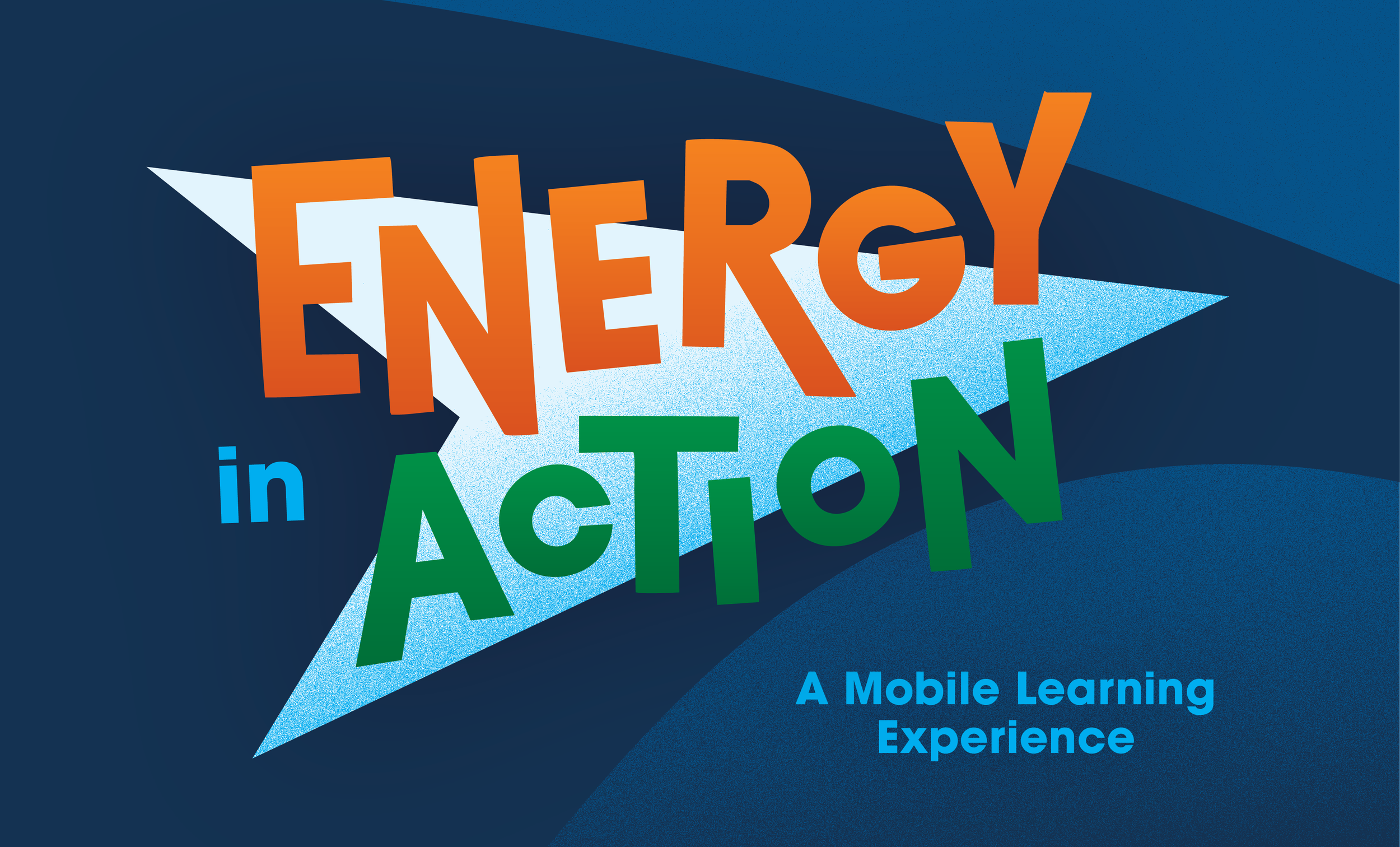
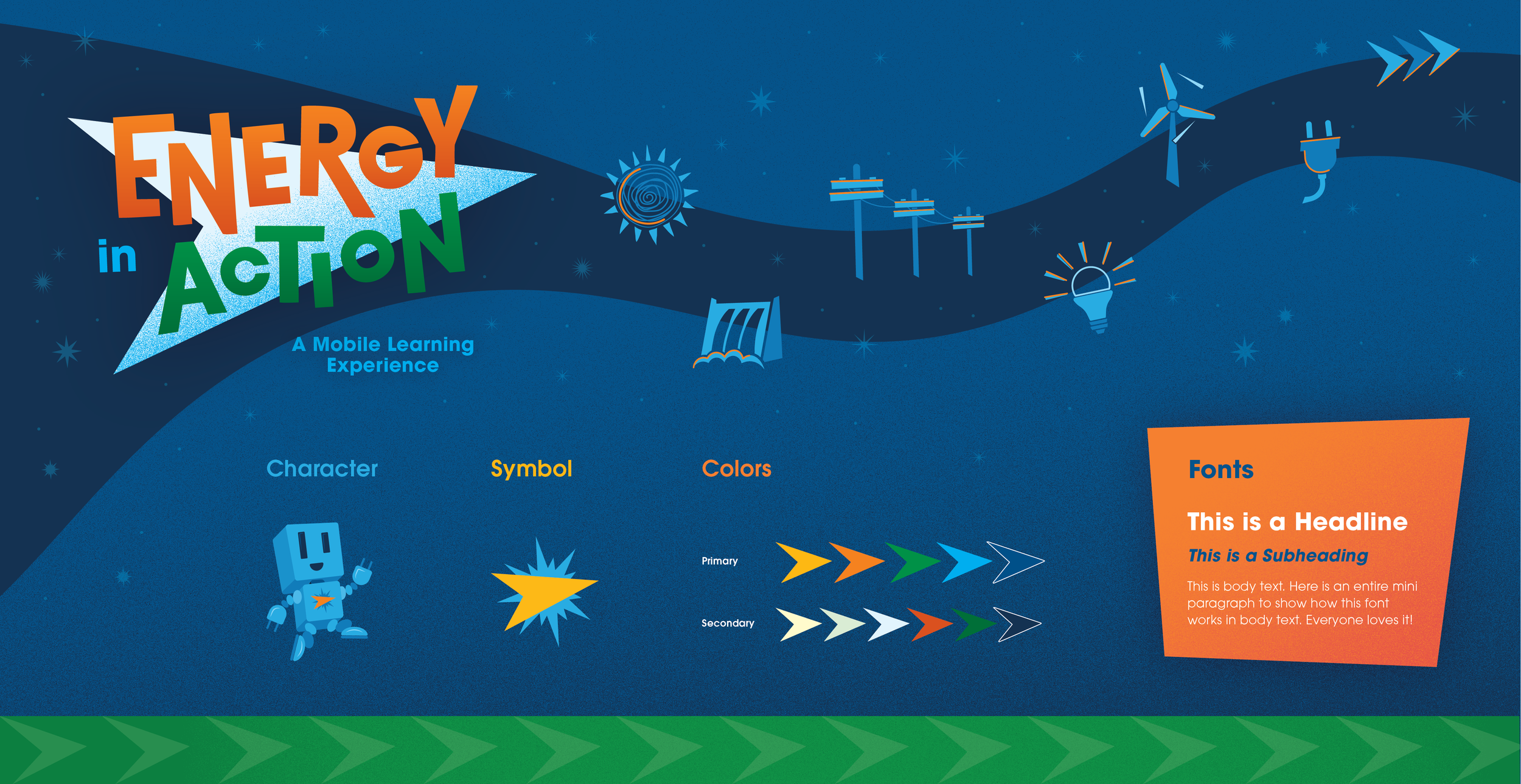
The new logo for the program features colorful text and an arrow shape, angled slightly askew and pointing onward and upward. This became a major motif of the whole brand, grounding the overall design with a forward-moving momentum. Though it was important to stay within the EnergizeCT color palette, I added a vibrant yellow to introduce variation and contrast. Rounding out the brand kit, I designed a suite of dynamic, geometric icons and a fun character named Watt Bot, who acts as a guide for students throughout the experience.
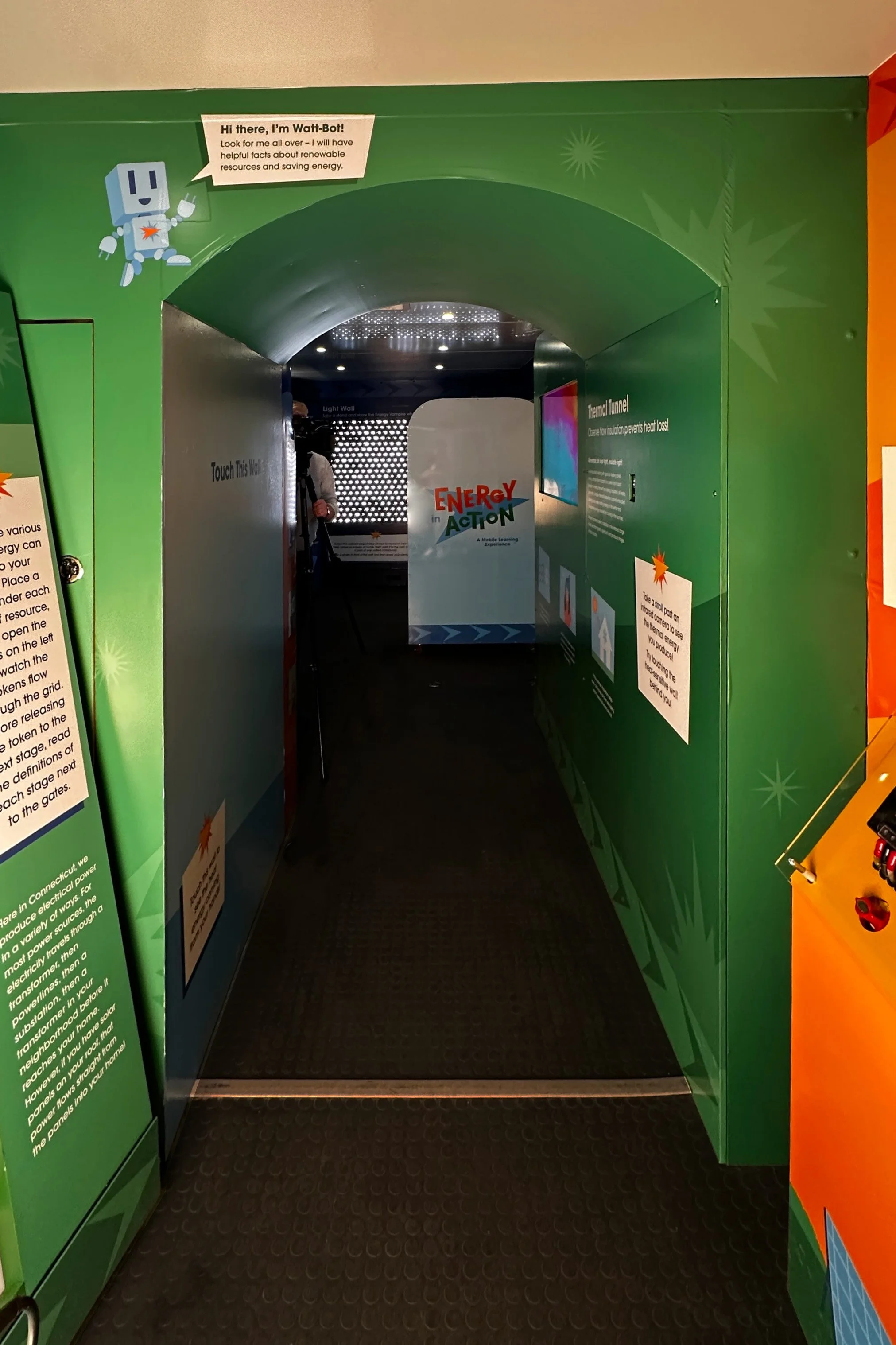
When designing the new wrap for the inside and outside of the trailer, I prioritized the student experience. I focused on accessibility by establishing a clear text hierarchy that remained consistent throughout the entire trailer, with careful attention to text size and color contrast. I also designed a motif combining the arrow from the Energy in Action logo with the sunburst from the EnergizeCT logo, which served as a wayfinding tool throughout the trailer. Wherever this motif appears, students know to find their instructions.
Conclusion: EnergizeCT was thrilled with the totally fresh design for the Energy in Action mobile exhibit. Not only is it visually striking and structurally renewed, the design centers on functionality while inspiring students to be the sustainability leaders of the future.
Program Rebrand
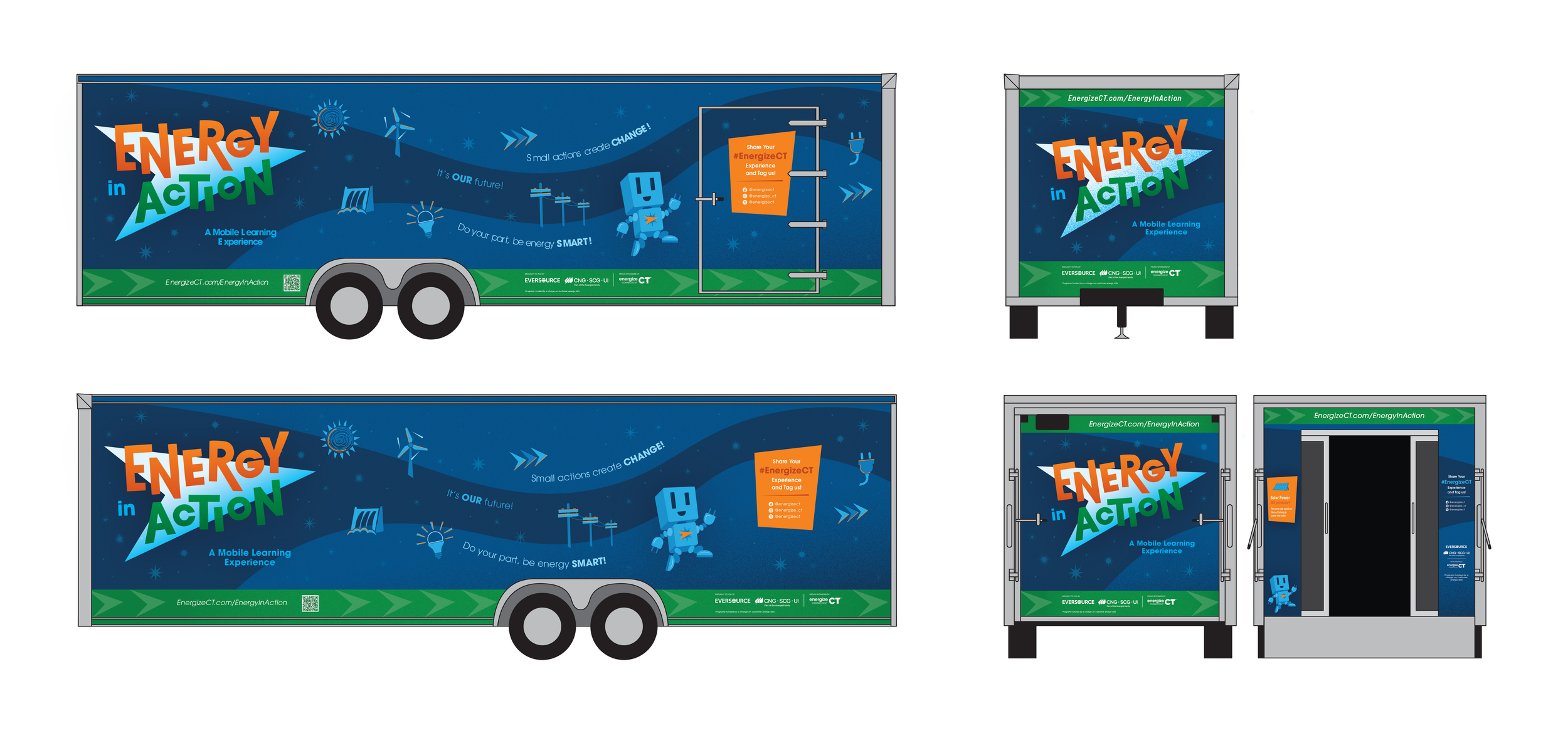
Exterior Trailer Wrap Design
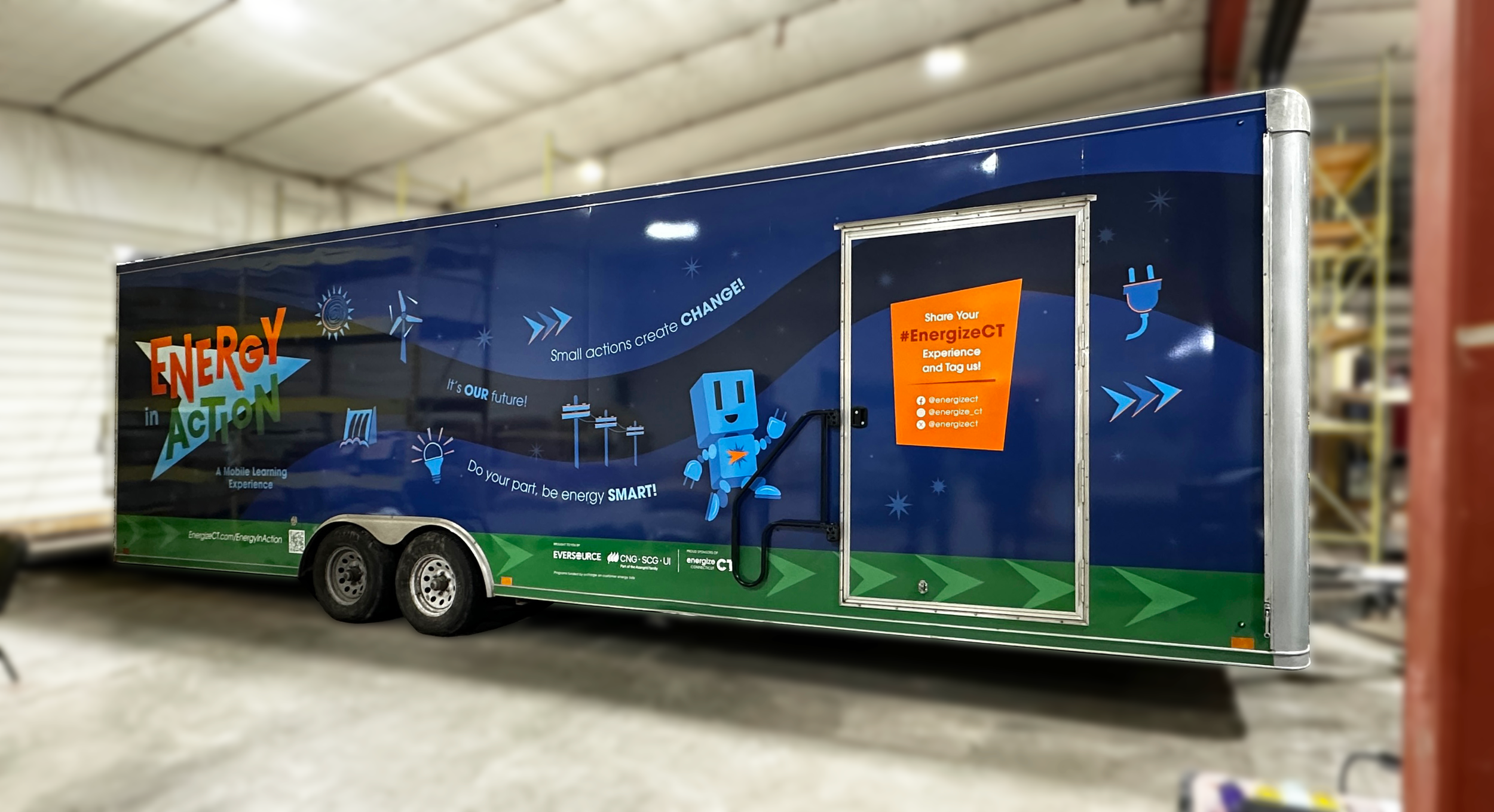
Exterior of Trailer
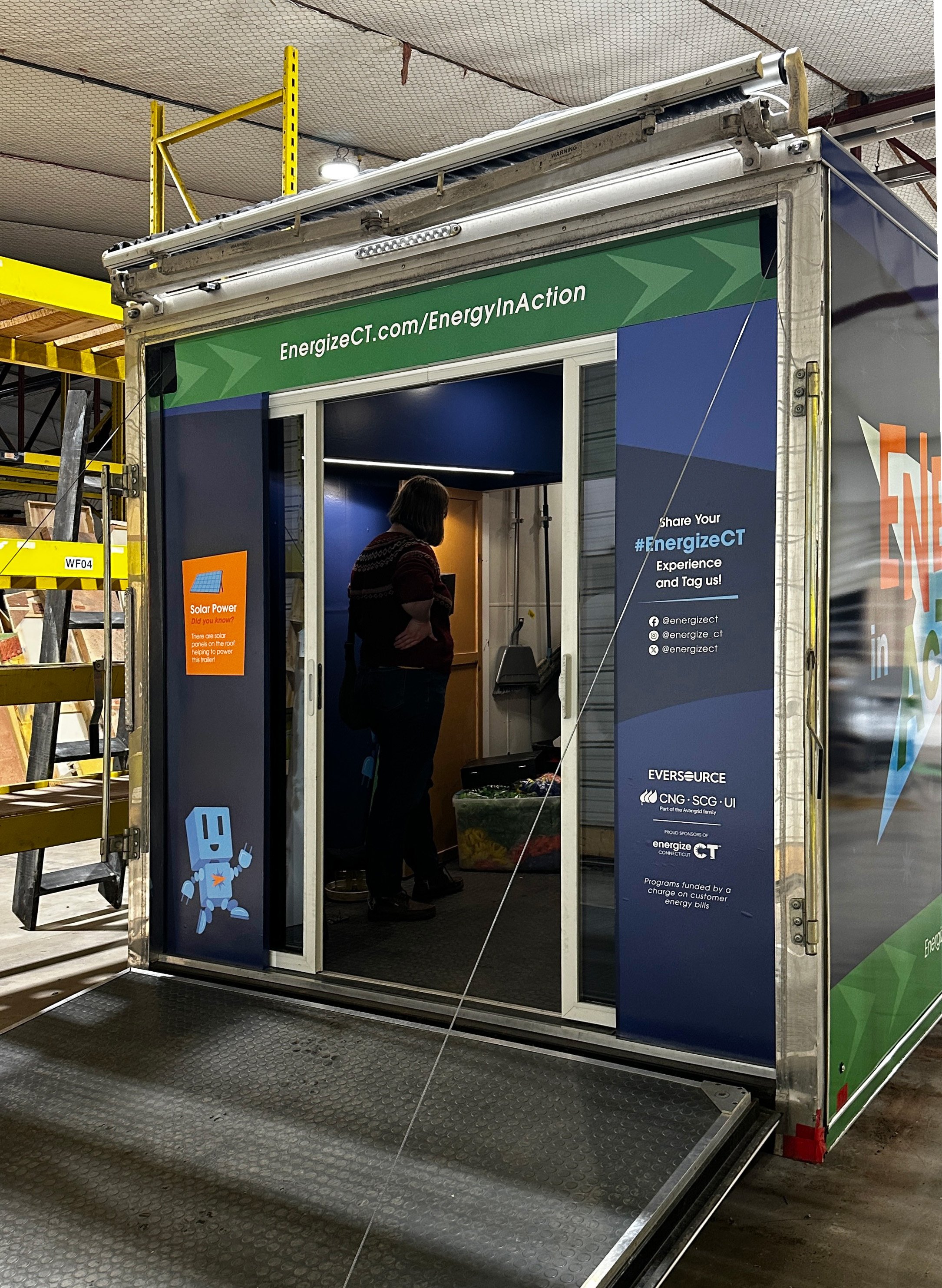
Back Door of Trailer
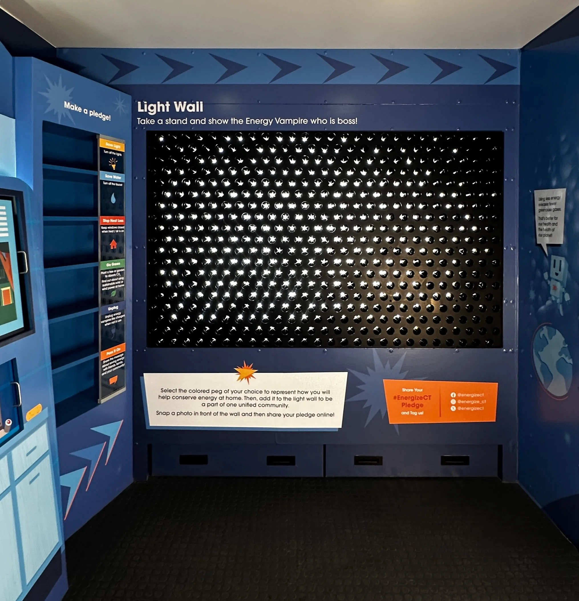
Light Wall
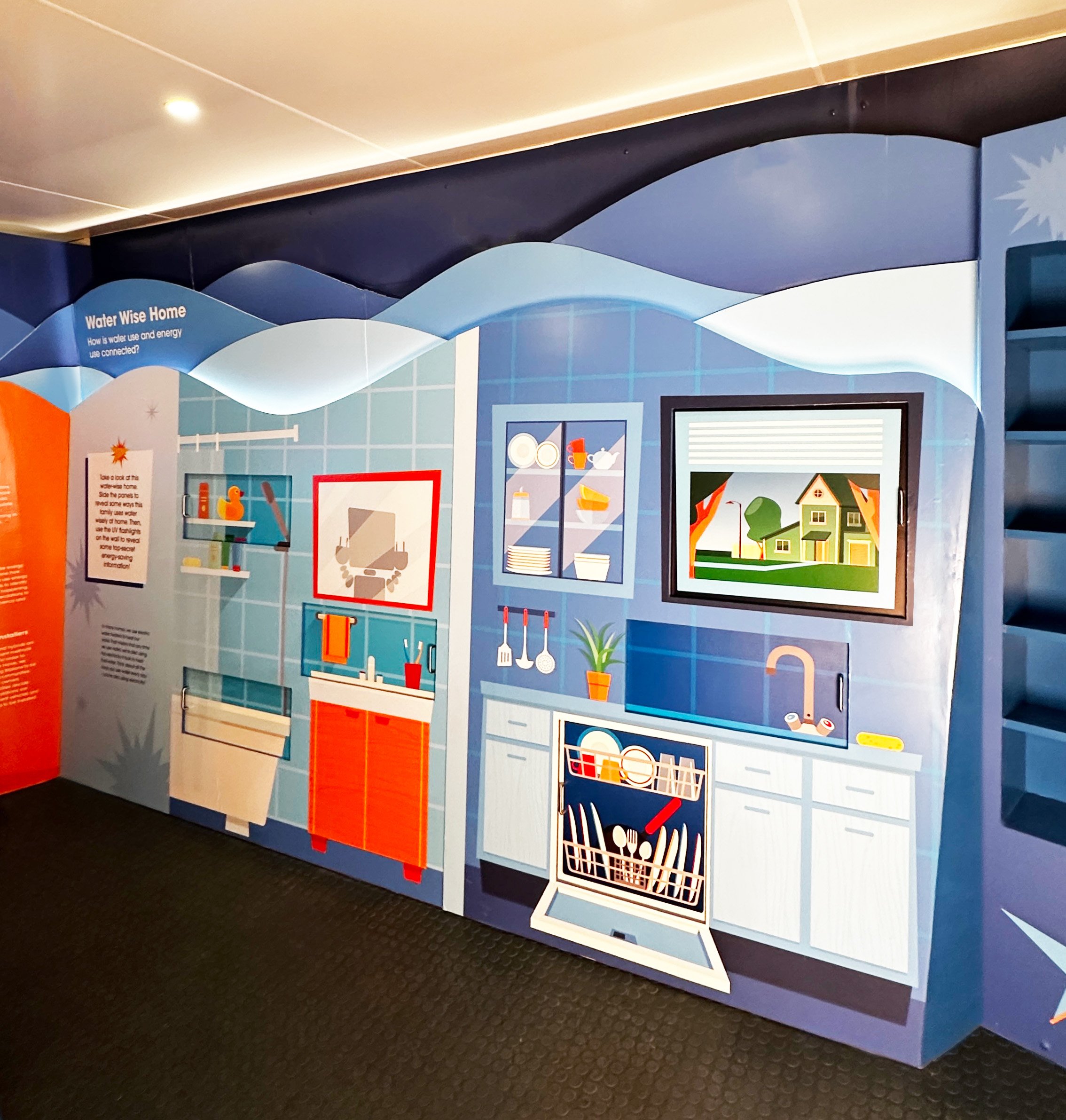
Water Wall
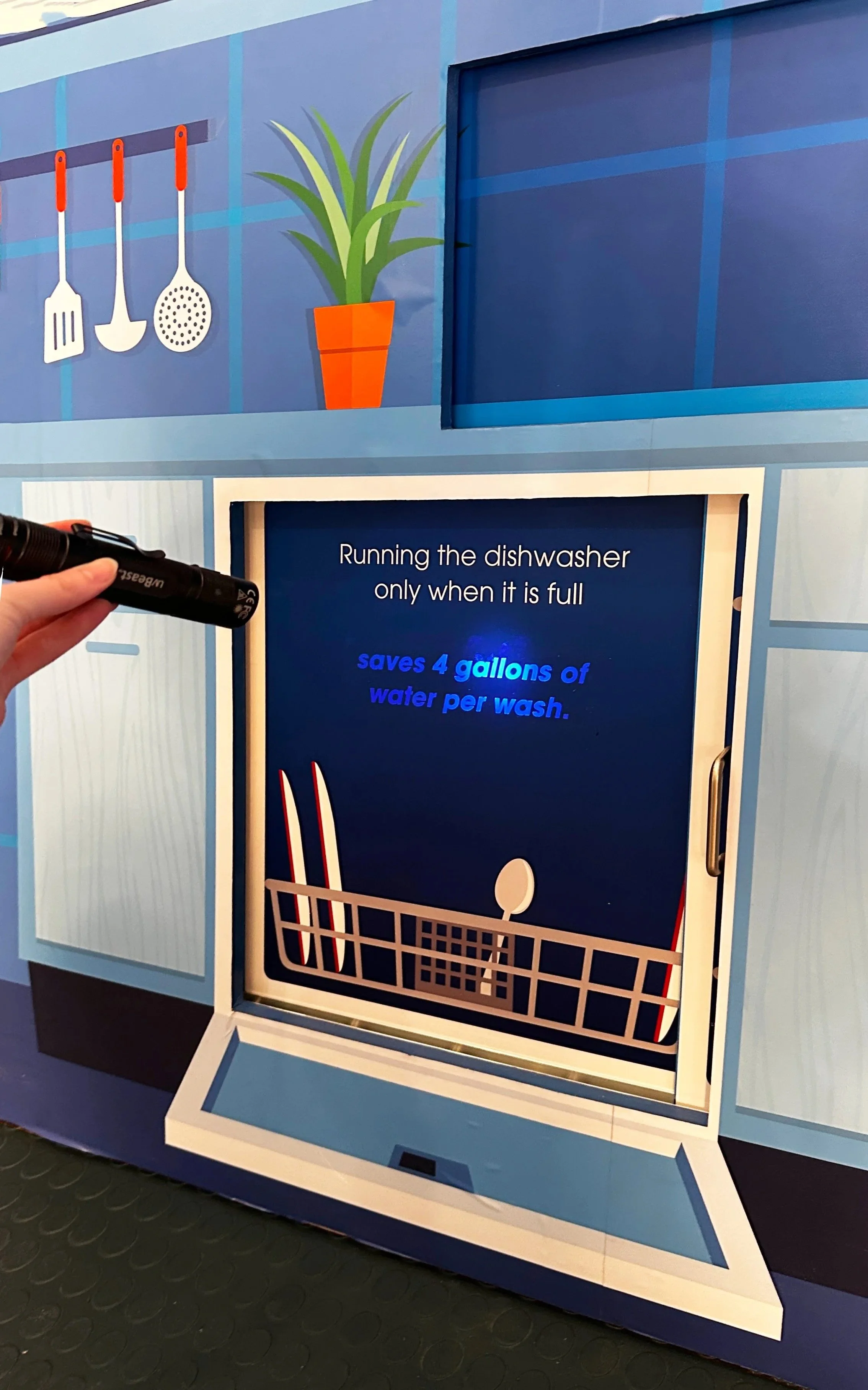
Water Wall Black Light
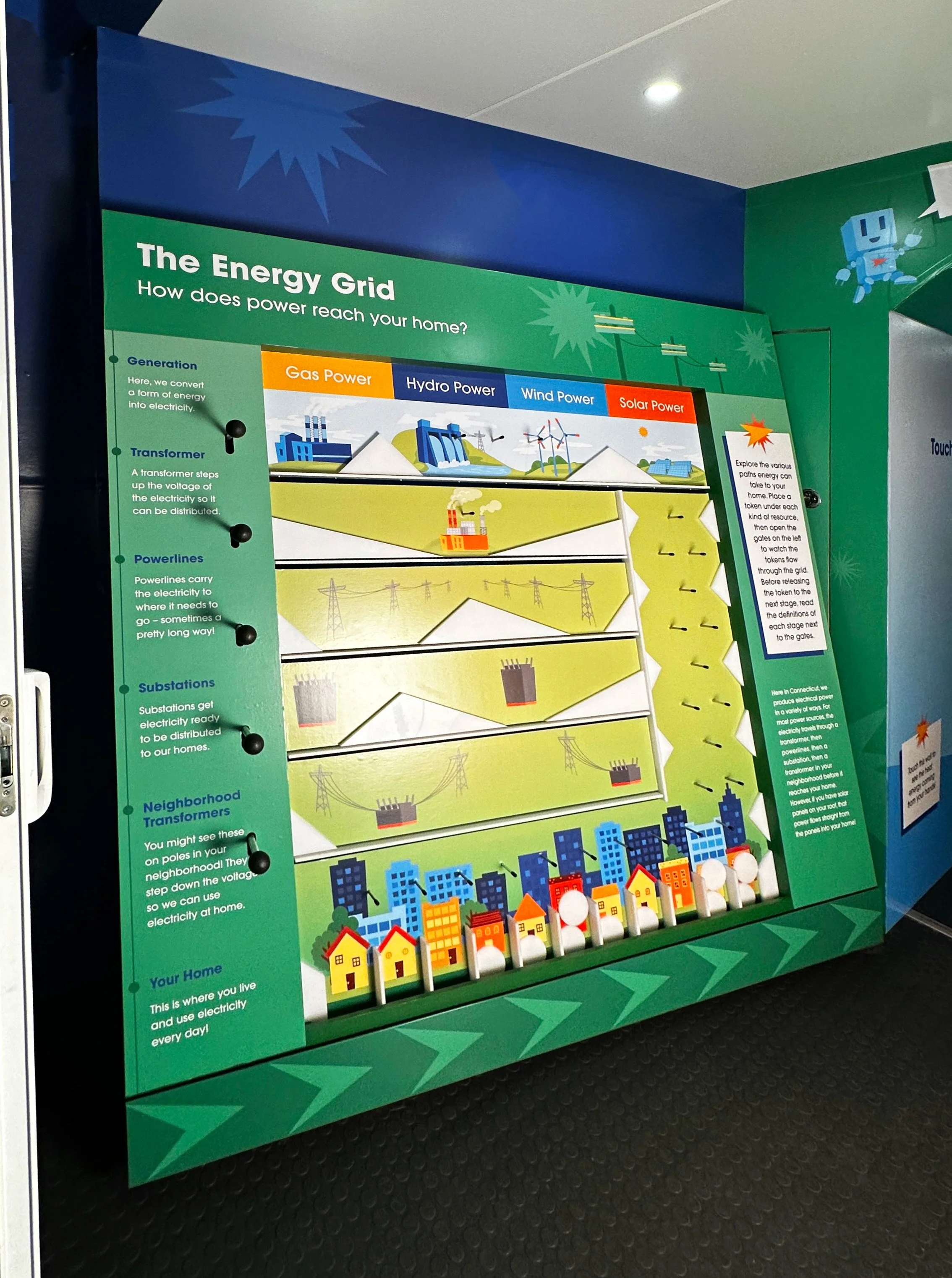
Energy Grid Plinko
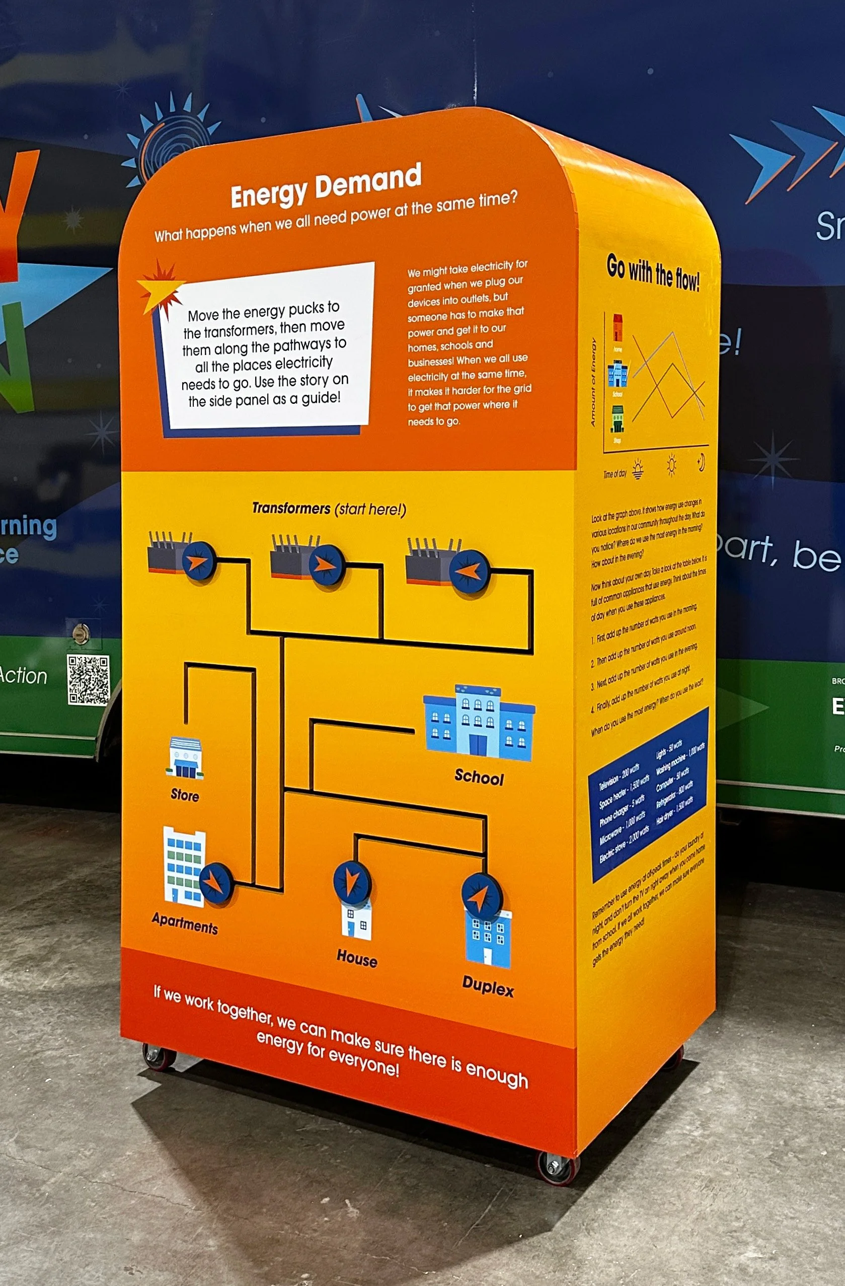
Energy Demand Station
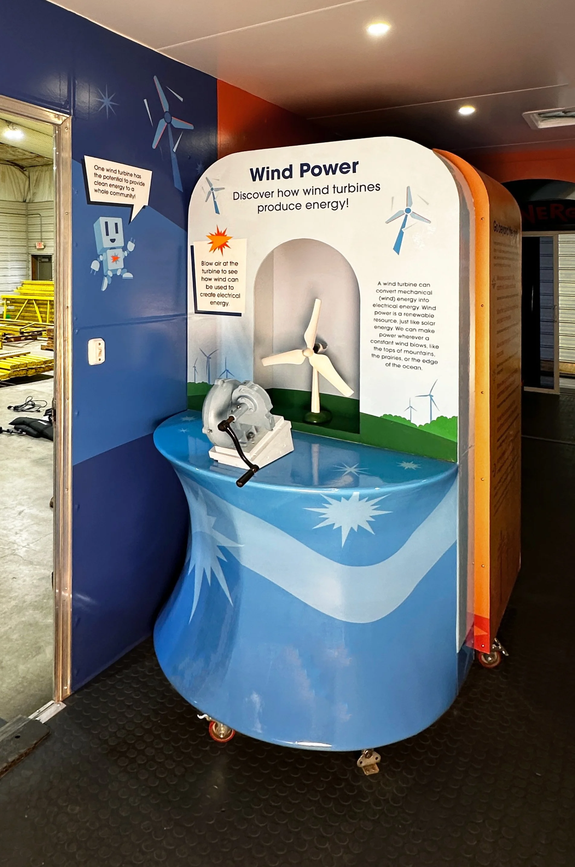
Wind Power Station
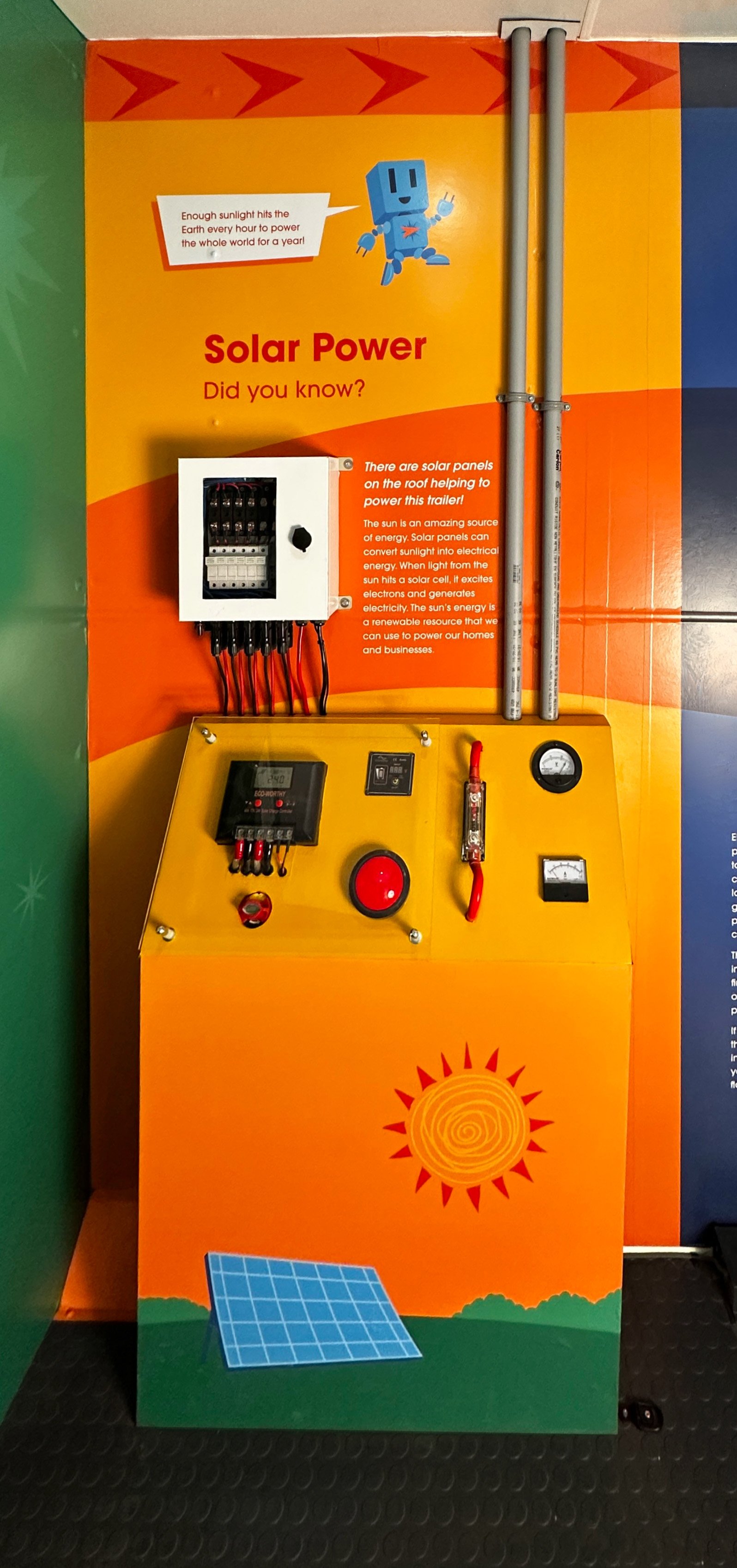
Solar Power
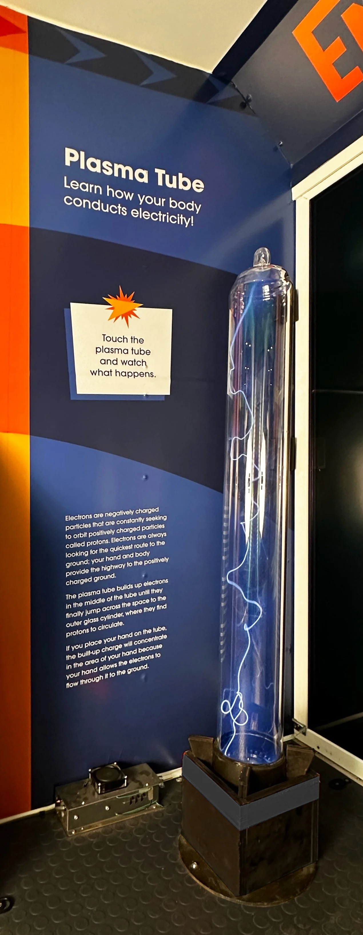
Plasma Tube
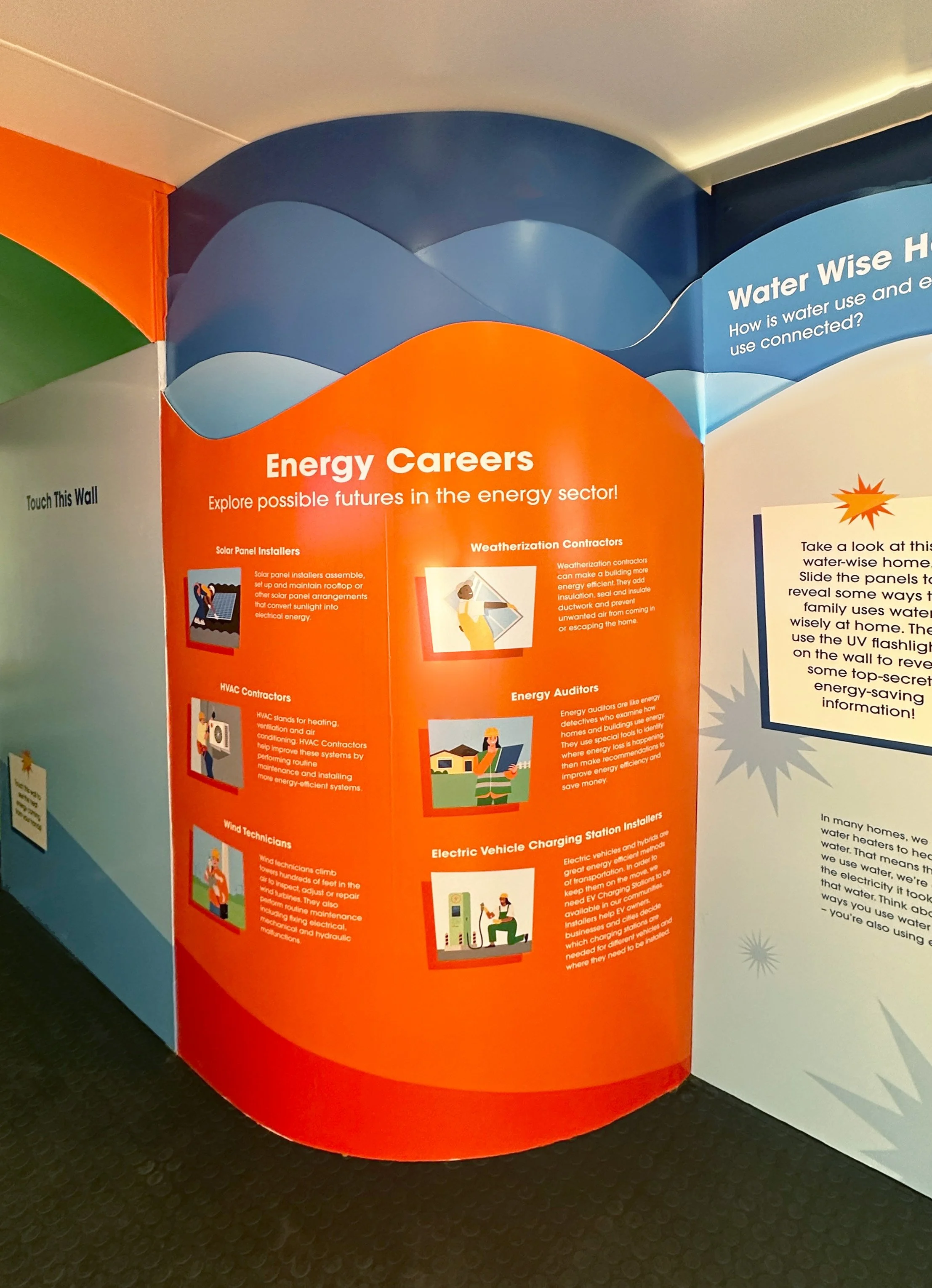
Energy Career Wall
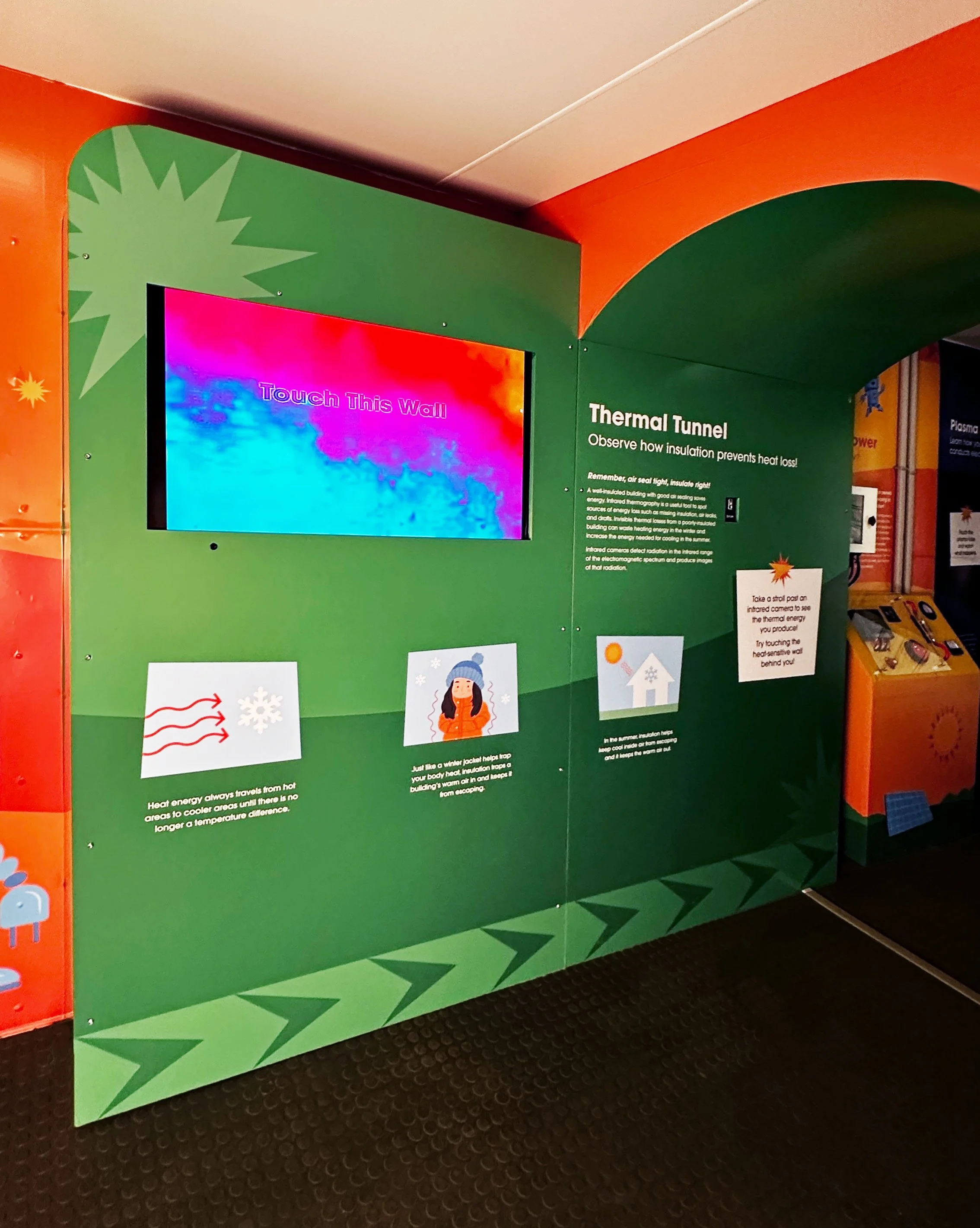
Thermal Tunnel
Thermal Tunnel Archway
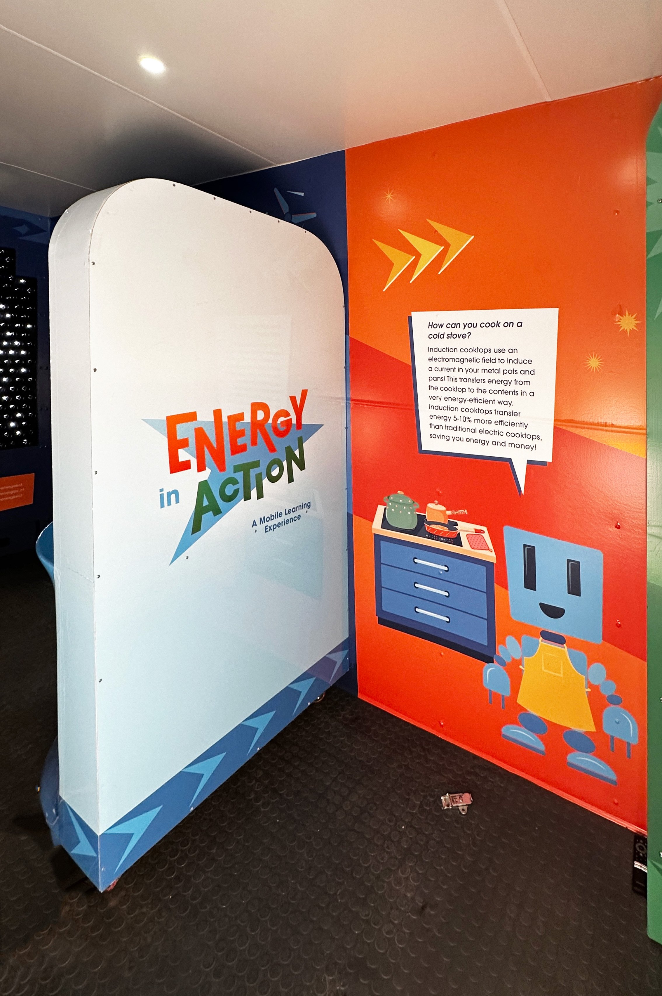
Induction Cook Top Info